Flos & Moss
Mobile UI ∙ UX Design ∙ UX Research

Objective
How might we design a flower delivery app that allows customers to find and customise their ideal bouquets conveniently whilst still supporting local florists?
Course
Google Coursera UX Design Certificate
Design Team
UX/UI Designer & Researcher (Me)
Timeline
July 2023 - November 2023
My Role
As my first project for the Google Coursera UX Design certificate, I was exposed to an end-to-end design process and responsible for all phases. Key responsibilities included:
-
Developing inclusive personas with unique challenges
-
Defining the UX research goals
-
Creating paper and digital wireframes, converting into lo-fi and hi-fi prototypes
-
Conducting 2 user testing sessions, and developing 3 full iterations
-
Analysing and synthesising the data into insights to optimise designs
The Process
Empathise
User Personas
Flos & Moss would accommodate for anyone interested in buying and delivering bouquets for themselves, or to loved ones anywhere in the world. As the app has extended information and reviews for each bloom and bouquet product, it would especially be accessible to users who may feel unfamiliar or overwhelmed with the choice, or those with visual impairments who may want more descriptive detail.
Two personas represent the primary and secondary users most likely to engage with Flos & Moss, with unique challenges and pain points. User stories were created after determining their problem and hypothesis statements.
Tabitha Olsen
Tabs represents users who are more passionate about flower arranging and buying bouquets for others as well as themselves. She also represents users with visual impairments who want to ensure they are receiving the best quality products
USER STORY
"As a flower-lover with a visual impairment, I want to be able to use accessibility tools seamlessly on florist apps so I know I'm ordering the best quality product."

Finley Robinson
Finn represents users who are less familiar with flowers and the bouquet buying process and seek to have access to an efficient solution which ensures their loved ones still receive something personalised and special.
USER STORY
"As a busy full-time engineer with limited knowledge on flower arranging, I want to still be able to surprise my partner with bouquets I know she'll love."

Empathise
Empathy Mapping
Focussing on Tabitha as our primary user, an empathy map was created to illustrate how a customer may think, feel or say, in order to better understand who is being designed for, and what may drive their behaviours in the bouquet customising, ordering and delivery process. Her pain and pleasure points were then documented from the overall message of the map.

PAIN POINTS
-
Unable to use tools such as read assist on florist apps
-
Limited freedom to customise products
-
Lack of visual description means uncertainty of the product ordered
-
“I want to buy locally but...”
PLEASURE POINTS
-
Being content with the product ordered, quality comes as expected
-
Delivering bouquets to her own or other peoples’ addresses easily
-
Saving time with a quick ordering process

User Journey Map
Empathise
User Journey and Flow Mapping
A user journey map was created to explore how users can reach their goals by using the app. After forming tasks, documenting feelings and improvement opportunities, a user flow diagram was drawn to map how users can then achieve specific goals as they move through the app.
Design
Storyboarding
After determining the main pain needs and goals of target users, big-picture and close-up storyboards were sketched following the user flow diagram. Both illustrate a complete journey: the big-picture storyboard visualising the entire user experience, and the close-up storyboard presenting the product itself and Tabitha's feelings as she's navigating this journey.


Design
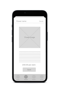
Wireframing: Iteration 1.0
The landing page was first drafted and decided on paper - a simple paper prototype was also made to determine the best feel for the UI theme, navigation and menu system. The chosen home screen was replicated into Figma, following the remaining key pages of the app, decided by the user flow map.


Homepage
Marketplace
Florist Browsing
UX Research
Competitive Analysis
In order to understand the market, companies such as Interflora and Bloom & Wild were explored for their branding, offers, and website and app features. Smaller independent stores as well as indirect competitors were also researched to understand the scope of the florist industry. Upon examining competitors' strengths and weaknesses, a detailed understanding was gained about this market, and even revealed gaps and opportunities which informed possible iterations.
Key Findings
& Market Gaps
-
2 of the large companies did not have the option to customise products
-
Those that did offer bouquet customisation, did have a way to make the customisation process very visual
-
The websites and apps of most large and small businesses had a weak compatibility with accessibility tools
📝
Opportunities
-
Create a designing interface to preview bouquets and have more freedom to customise products
-
Ensure websites are central (.com) and provide the option to change region for ease at check out (if providing international services or delivery)
-
Have at least alt text to be more compatible with accessibility tools
💡
UX Research
User Testing 1
A research study plan was compiled to conduct the moderated usability test smoothly and ensure all areas were covered. This included an introduction, 4 research questions, 4 KPIs, methodology, participant details and a script with 5 tasks.
Affinity Mapping:
An affinity map was created using results from the usbability study, synthesising the data into common relationships. Within these groups, patterns and themes were identified, which helped to create actionable insights going forward.


1 of 14
Research Presentation:
In place of a UX research report, a presentation deck was compiled to showcase test findings, previous designs, themes, insights and next steps for the third iteration.
🏠
Preference for Home Page
It was observed that 3 out of 5 participants preferred surfing the homepage to find florists. It may be the most desirably designed, or that it is standard to navigate.
📍
Preference for 'Local'
3 out of 5 participants instantly preferred to choose a florist that came under the ‘local’ category. This means that most users may prefer to shop locally from the app.
💸
Discounts & Incentives
2 out of 5 participants questioned the ability to apply a discount, or incentives at the checkout section. This means that users expect these options to be present.
UX Research
Actionable Insights
Trouble finding the Design Space
Although the Design Space was easily located by most participants, there were suggestions to improve it's ease of navigation by prioritising it as a shortcut on the bottom navigation bar.
Trouble understanding the 'Save' feature
When saving flowers for bouquet customisation, some participants did not understand the 'Save' feature. This could be improved with a design that aligns more to industry standards.
Lack of option to use discounts
2 of 5 participants from the usability study directly expressed a concern over the lack of discount code section at the checkout. The existing Flos Points systems could also be made clearer.
Iteration Two


Insight 1 (P0)
Make the Design Space easier to locate and navigate.
The Design Space, previously located at the end of the chosen florist’s page with no direct access from any menus, is now given priority as a feature on the app and located on the bottom navigation bar as per popular feedback.
Before
After
Insight 2 (P1)
Remodel the 'Save' feature for the bouquet customisation process.
Previously, information about a flower would appear in a pop up, where you could then save it after reading the details each time. Now, the ‘heart’ saving shortcut allows for quick saving through a large list of options.

Before
After

Before

After
Insight 3 (P2)
Redesign the checkout pages to include a discount section.
The checkout section now includes a discount code input field, as well as the option to spend Flos points. This adds a section providing the opportunity for incentives either by Flos & Moss or externally from partnering florists.


Design
Mockups
Upon Tweaking the designs from the first user testing, the wireframes and low fidelity prototype were translated into high fidelity mockups and a design system was established.
Checkout Summary
Payment Page
Homepage
UX Research
User Testing 2
A second research plan was made by amending the first plan, adding new goals and tasks which accommodated the improvements made to iteration two. Main feedback and concerns focused around visual elements as opposed to usability this time.
📖
Improved Readability
The colour palette was changed to be at a higher contrast, and different typefaces were narrowed down to one font so users can flow more seamlessly throughout the app.
📱
Continuous Scroll
"The homepage feels a bit like it has a dead end with the view further away button". The 'end' of the page is now designed to refresh with further away shops specifying under a heading.
📐
Spacing
Improvements were made to the overall structure upon further research into mobile UI design, such as 16px borders to avoid unnecessary empty space.
UX Research
Actionable Insights
Issues with readability
Reducing typestyles within the application interface
Reducing empty space - 16px either side for mobile
Concerns with the overall colour palette
Using a higher contrast colour palette and making title text stand out better. More saturated colours were also added on important elements such as star ratings to stand out further and continue engaging the user. Checked the colours against WCAG AA compliance
Improved user flow
Although the feedback from this study mostly flagged up potential visual improvements, minor changes to the flow were still picked up on such as having multiple directions to the Bouquet Builder. A button was added at the bottom of some pages.
Final Designs


Colours
Typography
Page Title: Open Sans regular 22pt
Paragraph Title: Open Sans Regular 20pt
Primary Text: Open Sans Regular 16pt
Secondary Text: Open Sans Regular 14pt
Tertiary Text: Open Sans Regular 12pt
Design System
Resources

Illustrations from
unDraw
Icons from
Google Material Design & Icons8

Photos from
Unsplash

WCAG accessibility evaluation with
WebAIM
Design
Next Steps
Although the third iteration marked the end of this coursework project, there are still more features for the app that I would like to develop and test, and improvements that could still come out of the existing data from both sessions of user testing.
Develop Bouquet Builder
Throughout both sessions of usability testing, the bouquet builder (formerly 'design space') received the most feedback for improvement, but equally the most interest of all features from testers. Continuing to develop the Bouquet Builder will ensure a space is made for ordering easily customised products.
Expand Digital Prototype
Besides the key user flow for this particular iteration and prototype, other areas of the app still exist that I would like to create mockups and full interactions of in the future:
-
Welcome and log in screens
-
Full page reviews
-
Exploring the Mossy AI features and interfaces
-
Pages in settings
-
Live delivery tracking screen
-
Dark mode
Optimise Account Holder and Community Features
It is possible that with the existence of reviews, a discussion board or community that discusses topics such as seasonal flowers or shares bouquet arranging tips may enhance a user's experience. With additional usability testing, additional features that come with holding a registered account could be explored.